JsPlumb Angular
JsPlumb has a service and several components/directives to assist you in integrating with Angular 16+. If you're running an earlier Angular version than 16, you'll need to use our legacy Angular integration.
Imports
"dependencies":{
  "@jsplumbtoolkit/browser-ui-angular":"6.81.0"
}
Setup
You need to import the jsPlumbToolkitModule:
import { jsPlumbToolkitModule } from '@jsplumbtoolkit/browser-ui-angular';

...

@NgModule({
    imports:      [ BrowserModule, jsPlumbToolkitModule],
    declarations: [ SomeComponent ],
    bootstrap:    [ SomeComponent ],
    schemas:[ CUSTOM_ELEMENTS_SCHEMA ]
})
Be sure to import the CUSTOM_ELEMENTS_SCHEMA schema. Without this import you will not be able to map components to node/group types.
Quick start
Here's a basic setup that uses the jsplumb-surface component to render a couple of nodes and an edge:
import {Component} from "@angular/core"

@Component({
    template:`<div style={{width:"100%",height:"100%"}}>
        <jsplumb-surface [data]="data"></jsplumb-surface>
        <jsplumb-controls></jsplumb-controls>
        <jsplumb-miniview></jsplumb-miniview>
        </div>`
})
export class DemoComponent {

    data = {
        nodes:[
            { id:"1", label:"1", left:50, top:50},
            { id:"2", label:"TWO", left:250, top:250}
        ],
        edges:[
            { source:"1", target:"2" }
        ]
    }

}
In the above example the only attributes we set on the jsplumb-surface was data, meaning the component uses a default Absolute layout and a default Angular component for rendering nodes. The jsplumb-surface, though, is highly configurable, mainly through its view and renderParams inputs. Here's the same example from before but with a few more things configured, and an Angular component to render nodes with:
NodeComponent
import {Component} from "@angular/core"

import { BaseNodeComponent } from '@jsplumbtoolkit/browser-ui-angular';

@Component({
    template:`<div style={{width:"60px", height:"60px", backgroundColor:"white", border:"1px solid black", text-align:"center"}}>
    <h3>{{obj.label}}</h3>
    </div>`
})
export class NodeComponent extends BaseNodeComponent {

}
DemoComponent
import {Component} from "@angular/core"

import { NodeComponent } from './node.component';

@Component({
    template:`<div style={{width:"100%",height:"100%"}}>

        <jsplumb-surface [data]="data"
                [renderParams]="renderParams"
                [view]="view"></jsplumb-surface>

        <jsplumb-controls></jsplumb-controls>
        <jsplumb-miniview></jsplumb-miniview>
        </div>`
})
export class DemoComponent {

    view = {
        nodes:{
            default:{
                component:NodeComponent
            }
        }
    }

    data = {
        nodes:[
            { id:"1", label:"1", left:50, top:50},
            { id:"2", label:"TWO", left:250, top:250}
        ],
        edges:[
            { source:"1", target:"2" }
        ]
    }

    renderOptions = {
        layout:{
            type:"ForceDirected"
        },
        grid:{
          size:{
            w:50, h:50
          }
        }
    }

}
Rendering Nodes and Groups
At the core of your UI will be a jsplumb-surface, which provides the canvas onto which nodes, groups and edges are drawn. In the Quickstart section above we show a couple of examples of the jsplumb-surface in action.
Each node or group in your UI is rendered as an individual Angular component. In the first example above, we rely on JsPlumb's default Angular component to render each node, but in the second we provide a component ourselves, although its quite simple. In a real world app your component will likely be more complex, and can take full advantage of all the power that Angular offers. As an example, consider the component we use to render nodes in the Flowchart Builder:
import {Component} from "@angular/core"
import {BaseNodeComponent} from "@jsplumbtoolkit/browser-ui-angular"

import { anchorPositions } from "./app.component"

@Component({
    template:`<div style="color:{{obj.textColor}}" class="flowchart-object" data-jtk-target="true">

        <jtk-shape [obj]="obj" showLabels="true" labelProperty="text" [width]="obj.width" [height]="obj.height"></jtk-shape>

        <div *ngFor="let anchor of anchorPositions"
             class="jtk-connect jtk-connect-{{anchor.id}}"
             [attr.data-jtk-anchor-x]="anchor.x"
             [attr.data-jtk-anchor-y]="anchor.y"
             [attr.data-jtk-orientation-x]="anchor.ox"
             [attr.data-jtk-orientation-y]="anchor.oy"
             data-jtk-source="true"></div>

        <div class="node-delete node-action delete" (click)="this.removeNode()"></div>
    </div>`
})
export class NodeComponent extends BaseNodeComponent {
    anchorPositions = anchorPositions
}
The components you use to render nodes with JsPlumb Angular are entirely at your discretion, and can be as simple or as powerful as you like.
Mapping types to components
The view input is used to map node/group types to components, and to certain behaviours. For instance, this is the nodes section of the view for the flowchart builder starter app:
view = {
    nodes: {
      [DEFAULT]:{
        component:NodeComponent,
        // target connections to this node can exist at any of the given anchorPositions
        anchorPositions,
        // node can support any number of connections.
        maxConnections: -1,
        events: {
          [EVENT_TAP]: (params) => {
            this.edgeEditor.stopEditing()
            // if zero nodes currently selected, or the shift key wasnt pressed, make this node the only one in the selection.
            if (this.toolkit.getSelection()._nodes.length < 1 || params.e.shiftKey !== true) {
              this.toolkit.setSelection(params.obj)
            } else {
              // if multiple nodes already selected, or shift was pressed, add this node to the current selection.
              this.toolkit.addToSelection(params.obj)
            }
          }
        }
      }
    }
  }
To map a node/group type to a component, you supply a reference to the component's class as the component in a mapping, as shown above.
Using @Input in a node/group component
There are two approaches to injecting values into a node/group component.
Injecting values from the backing data
Imagine the component shown above was being used to render some node type in your UI - with a couple of small changes we can make it so:
import {BaseNodeComponent} from "@jsplumbtoolkit/browser-ui-angular"
import {EventEmitter, Component, Input, Output} from "@angular/core"

@Component({
  template:`
          <div>
              <h1>{{title}}</h1>
              <button class="btnEmit" (click)="emitEvent('test')">Click Me</button>
          </div>
      `
})
export class NodeComponent extends BaseNodeComponent {
  @Input() title:string

  @Output() outputEvent = new EventEmitter<string>()

  emitEvent(value:string) {
    this.outputEvent.emit(value)
  }
}
We've removed selector from the Component spec, since it's not relevant when rendering via the Surface, and we've wired up the component to extend BaseNodeComponent, but other than that the component is the same as in the first example.
JsPlumb will attempt to set this input from the backing data for the node. So if, for instance, you had this data object for a node:
{
  "id": "1",
  "title": "My First Node"
}
then JsPlumb will set "My First Node" on the title input. This is of course really just a form of syntactic sugar - you could just easily render the title in your template like this (remembering that obj is set on the component by the Toolkit when it creates it):
<h1>{{obj.title}}</h1>
as you can by using the input on the class:
<h1>{{title}}</h1>
but if you're like me, you might find that the approach using @Input feels a little more nicely formalised.
Injecting values from the view
An alternative approach to injecting values from a node or group's backing data is to provide a string or a function inside of the view from which JsPlumb will get the value to use. Consider again the component from above:
import {BaseNodeComponent} from "@jsplumbtoolkit/browser-ui-angular"
import {EventEmitter, Component, Input, Output} from "@angular/core"

@Component({
  template:`
          <div>
              <h1>{{title}}</h1>
              <button class="btnEmit" (click)="emitEvent('test')">Click Me</button>
          </div>
      `
})
export class NodeComponent extends BaseNodeComponent {
  @Input() title:string

  @Output() outputEvent = new EventEmitter<string>()

  emitEvent(value:string) {
    this.outputEvent.emit(value)
  }
}
We can map this component in our view and provide a function to populate title at render time:
view:{
    nodes:{
        default:{
            component:NodeComponent,
            inputs:{
                title:(n:Node) => 'here you can return any string you like'
            }
        }
    }
}
Using @Output in a node/group component
You can also now wire up listeners to @Outputs in your components. The process to do this involves providing a vertexEvent callback to the Surface component. For example, imagine you embed a surface component in one of your components:
<div class="my-component">
    <h3>Here is my component</h3>
    <jsplumb-surface [view]="view"
                   [renderParams]="renderParams"
                  (vertexEvent)="vertexEvent($event)">
    </jsplumb-surface>
</div>
Remember from above the @Output() outputEvent... declaration on the node component? Whenever that output emits something, the Surface will invoke vertexEvent:
import { Vertex } from "@jsplumbtoolkit/browser-ui"
import { ComponentRef } from "@angular/core"

vertexEvent(detail:{
    vertex:Vertex,
    event:Event,
    payload:any,
    component:ComponentRef<any>}) {

}
The callback is given JsPlumb's vertex, the original event, the payload (ie. whatever was emitted from the output), and the Angular ComponentRef. You can access the specific Angular component via the instance field on this component ref.
Rendering Ports
Some applications whose data model use ports have a UI in which each Port is assigned its own DOM element. In the Flowchart Builder application we use ports in the data model (a question node, for instance, has a Yes and a No output port), but we do not assign a DOM element to each port. In the Schema Builder, though, we do: we model a database table as a node, and the columns on that table as ports, and each port is assigned its own DOM element:
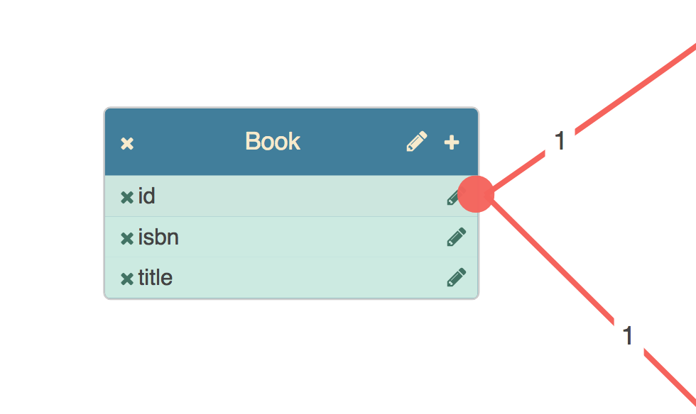
Here we see three columns, each of which has a button by which it can be deleted, and a button that launches a column name editor. These two bits of behaviour are handled by the component backing the port.
Definition
This is the definition of the component used to render columns on table nodes:
import { BasePortComponent } from "@jsplumbtoolkit/browser-ui-angular";

@Component({
  selector:"db-column",
  templateUrl:"templates/column.html"
})
export class ColumnComponent extends BasePortComponent {

  constructor(el: ElementRef) {
    super(el);
  }

  remove() { ... }

  editName() { ... }
}
There are three requirements for a component to be used to render a port:
- you must extend
BasePortComponent - your constructor must accept an
ElementRefand call the superclass constructor with it - you must declare a selector for the component
Template
The component definition maps a templateUrl. This is what the template looks like in this example:
<div class="table-column table-column-type-{{obj.datatype}}"
     attr.primary-key="{{obj.primaryKey}}" attr.data-jtk-port="{{obj.id}}"
     data-jtk-source="true" attr.data-jtk-scope="{{obj.datatype}}" data-jtk-target="true">

  <div class="table-column-delete" (click)="remove()">
    <i class="fa fa-times table-column-delete-icon"></i>
  </div>

  <div><span>{{obj.name}}</span></div>

  <div class="table-column-edit" (click)="editName()">
    <i class="fa fa-pencil table-column-edit-icon"></i>
  </div>

</div>
Mapping to a type
You map components to port types in the view. Here's the ports section from the view in the Angular Database Visualizer application:
ports: {
  "default": {
    component: ColumnComponent,
    paintStyle: { fill: "#f76258" },		// the endpoint's appearance
    hoverPaintStyle: { fill: "#434343" }, // appearance when mouse hovering on endpoint or connection
    edgeType: "common", // the type of edge for connections from this port type
    maxConnections: -1, // no limit on connections
    dropOptions: {  //drop options for the port. here we attach a css class.
      hoverClass: "drop-hover"
    },
    events: {
      "dblclick": (p:any) => {
        console.log(p);
      }
    }
  }
}
Declaration
You must declare each port component in the declarations member of your
module definition. Here's the module definition for the Database Visualizer demonstration, for example:
import { DatabaseVisualizerComponent, TableNodeComponent, ViewNodeComponent, ColumnComponent } from './database-visualizer';

...

@NgModule({
    imports:[ BrowserModule, jsPlumbToolkitModule, ROUTING],
    declarations: [ AppComponent, TableNodeComponent, ViewNodeComponent, ColumnComponent, DatasetComponent, DatabaseVisualizerComponent ],
    bootstrap:    [ AppComponent ]
    schemas:[ CUSTOM_ELEMENTS_SCHEMA ]
})

...
Here we see ColumnComponent listed in declarations (along with the components used to render the node types table and view).
Checklist
- Each of your port components extends
BasePortComponentfrom JsPlumb Angular. - You reference the underlying data via the member
objin your component templates - Each of your components is declared in the
declarationslist in your module definition - You've mapped each expected port to a component in your
view
Change Detection
Default
If you're using Angular's default change detection mechanism (ChangeDetectionStrategy.Default) then your node/group/port/overlay components will be automatically updated whenever an updateNode, updateGroup, updatePort or updateEdge method is called on the Toolkit.
OnPush
If you'd prefer to use ChangeDetectionStrategy.OnPush, JsPlumb Angular can support that. The only requirement is that you need to inject a ChangeDetectorRef into any component with which you want to use OnPush change detection. For example, this is how we'd modify the ColumnComponent shown above to support OnPush change detection:
import { BasePortComponent } from "@jsplumbtoolkit/browser-ui-angular-legacy";

@Component({
    changeDetection:ChangeDetectionStrategy.OnPush,
    selector:"db-column",
    templateUrl:"templates/column.html"
})
export class ColumnComponent extends BasePortComponent {

  constructor(el: ElementRef, public changeDetectorRef:ChangeDetectorRef) {
    super(el)
  }

  remove() { ... }

  editName() { ... }
}
NOTE you must use the name changeDetectorRef for this constructor parameter, and you must also mark it public. JsPlumb discovers the change detector by name, not by type.
This also works for node/group components.
Shape libraries
A shape library is a set of named shapes that you will use to render SVG inside the vertices in your application. These are discussed in detail in the shape libraries and shape-sets pages; here we provide an overview of the available Angular integration with these modules.
Creating a shape library
In Angular, a shape library is created by registering one on the jsPlumbService:
import {Component} from '@angular/core';
import { FLOWCHART_SHAPES, BASIC_SHAPES } from "@jsplumbtoolkit/browser-ui";

@Component({
  selector: 'app-root',
  templateUrl: './app.component.html'
})
export class AppComponent {

    constructor(public $jsplumb: jsPlumbService) {
        this.$jsplumb.registerShapeLibrary([FLOWCHART_SHAPES, BASIC_SHAPES]);
    }

}
Here, we've injected jsPlumbService into our component, and then invoked registerShapeLibrary on it, to register our shape library. Note that we did not provide any identifier for our shape library in the above code; if your app has only only shape library you do not need to provide an id, as JsPlumb will use a default. But if you had more than one shape library you'd want to provide an id when registering them:
import {Component} from '@angular/core';
import { FLOWCHART_SHAPES, BASIC_SHAPES } from "@jsplumbtoolkit/browser-ui";

@Component({
  selector: 'app-root',
  templateUrl: './app.component.html'
})
export class AppComponent {

    constructor(public $jsplumb: jsPlumbService) {
        this.$jsplumb.registerShapeLibrary([BASIC_SHAPES], "basic");
        this.$jsplumb.registerShapeLibrary([FLOWCHART_SHAPES], "flowchart");
    }

}
Rendering an SVG shape
Shapes can be rendered with a jtk-shape. For example, here'a NodeComponent that we've mapped in our view, as shown above. This NodeComponent uses a jtk-shape inside its template:
import {Component} from "@angular/core"
import {BaseNodeComponent} from "@jsplumbtoolkit/browser-ui-angular"

@Component({
    template:`<div style="color:{{obj.textColor}}" class="flowchart-object" data-jtk-target="true">
                <jtk-shape [obj]="obj" [width]="obj.width"
                            [height]="obj.height"></jtk-shape>
            </div>`
})
export class NodeComponent extends BaseNodeComponent { }
width, height and obj are all required inputs.
Again note the we did not tell the jtk-shape component how to find the shape library to use - it will use the default id. But if we wanted to specify a shape library, we'd do that with the shapeLibraryId input:
import {Component} from "@angular/core"
import {BaseNodeComponent} from "@jsplumbtoolkit/browser-ui-angular"

@Component({
    template:`<div style="color:{{obj.textColor}}" class="flowchart-object" data-jtk-target="true">
                <jtk-shape [obj]="obj" [width]="obj.width"
                            [height]="obj.height"
                            shapeLibraryId="basic"
                            ></jtk-shape>
            </div>`
})
export class NodeComponent extends BaseNodeComponent { }
Supported props
The list of props support by the jtk-shape component is:
| Input | Type | Description |
|---|---|---|
shapeLibraryId | string | The ID of the shape library to use. If not specified, a default will be used, which suffices for applications that are only using one shape library. |
obj | ObjectData | The data for the vertex to render. Required. |
width | number | Current width for the shape. Although it may seem counterintuitive, this is required - you'll need to set it to `[width]="obj.width"`. Angular's change detection will not pick up changes to this otherwise. |
height | number | Current height. See notes for `width`. |
showLabels | boolean | Whether or not to show labels. |
labelProperty | string | Defaults to `label`. The name of the property inside each vertex that contains its label. |
labelStrokeWidth | string | The stroke width to use for labels. Optional. Defaults to the Toolkit's default. |
By default the shape component will render just the shape. If you want to add labels you can do so like this:
import {Component} from "@angular/core"
import {BaseNodeComponent} from "@jsplumbtoolkit/browser-ui-angular"

@Component({
    template:`<div style="color:{{obj.textColor}}" class="flowchart-object" data-jtk-target="true">

                <jtk-shape [obj]="obj" showLabels="true"
                            [width]="obj.width"
                            [height]="obj.height"></jtk-shape>
            </div>`
})
export class NodeComponent extends BaseNodeComponent { }
By default, JsPlumb will extract the label from a label property in your vertex data. You can provide the name of the property to use if you want to, by setting the labelProperty on your jtk-shape:
import {Component} from "@angular/core"
import {BaseNodeComponent} from "@jsplumbtoolkit/browser-ui-angular"

@Component({
    template:`<div style="color:{{obj.textColor}}" class="flowchart-object" data-jtk-target="true">

                <jtk-shape [obj]="obj" showLabels="true"
                            labelProperty="text"
                            [width]="obj.width"
                            [height]="obj.height"></jtk-shape>
            </div>`
})
export class NodeComponent extends BaseNodeComponent { }
Adding your own shapes
To add your own shapes, you'll need to create a shape set. These are discussed on a separate page.
Exporting a Surface to SVG/PNG/JPG
It is possible to export a Surface that is using a shape library to SVG, PNG or JPG. For a full discussion of this, see this page. For convenience, we added several methods to our Angular integration to support this, as discussed below.
The methods are:
exportSvg<T extends ObjectData>(options:AngularSvgExportOptions<T>)
Exports a given surface to an SVG.
showSvgExportUI<T extends ObjectData>(options:AngularSvgExportUIOptions<T>)
Shows the Toolkit's SVG export UI
exportImage<T extends ObjectData>(options:AngularImageExportOptions<T>, onready:ImageReadyFunction)
Exports a given surface to an image (PNG or JPG)
showImageExportUI<T extends ObjectData>(options:AngularImageExportUIOptions<T>)
Shows the Toolkit's image export UI
exportPNG<T extends ObjectData>(options:AngularImageExportOptions<T>, onready:ImageReadyFunction)
Exports a given surface to a PNG
exportJPG<T extends ObjectData>(options:AngularImageExportOptions<T>, onready:ImageReadyFunction)
Exports a given surface to a JPG
There are four interfaces used by these methods - AngularSvgExportOptions, AngularImageExportOptions, AngularSvgExportUIOptions and AngularImageExportUIOptions. Each of these is an extension of an interface from the exporter, and each of these interfaces has these properties in common:
 /**
   * Surface to export
   */
  surface:Surface
  /**
   * Optional ShapeLibrary to use. If not supplied, supply `shapeLibraryId` - or ensure the Surface you are exporting has a ShapeLibrary registered on it.
   */
  shapeLibrary?:ShapeLibrary<T>
  /**
   * Optional ID of a ShapeLibrary to use - must have been registered on the jsPlumb Angular service via the `registerShapeLibrary` method. If not supplied,
   * supply `shapeLibrary` - or ensure the Surface you are exporting has a ShapeLibrary registered on it.
   */
  shapeLibraryId?:string
The key piece to keep in mind when exporting via Angular is that your Surface most likely does not have a shape library registered directly on it, due to the way shape libraries and surface are created when using the Angular integration.
We recommend you always register a shape library on the Angular service, which you can then retrieve via its ID, and provide as shapeLibraryId to one of the export calls. But keep in mind that if you're only using one shape library, you can register it without an id and the Toolkit will use a default - and it will also use that default ID when trying to retrieve a shape library to use for an export.
For example, this is from the flowchart builder starter pp:
exportSVG() {
    // use the `showSvgExportUI` method to popup the exporter window. Note that we do not need to provide a shapeLibrary
    // shapeLibraryId here, as the service will use a default shape library id if none is provided. We also did not provide an
    // id when we registered the shape library above, meaning it was registered with the default id.
    this.$jsplumb.showSvgExportUI({
      surface:this.surface
    })
  }
Dragging new nodes/groups
Palettes offer a means for your users to drag new nodes/groups onto your canvas. The SurfaceDropComponent allows you to configure drag/drop of HTML elements; there's also a ShapeLibraryPaletteComponent which is a specialised version of the SurfaceDropComponent that sources its draggable nodes from a ShapeLibrary.
HTML elements
To configure your UI to drag and drop HTML elements onto your canvas, you'll use a SurfaceDropComponent, which is a directive you declare via the inclusion of a specific attribute on some element in your template:
<div class="sidebar node-palette"
     jsplumb-surface-drop
     selector="div"
     [dataGenerator]="dataGenerator">
  <div *ngFor="let nodeType of nodeTypes"
            [attr.data-node-type]="nodeType.type"
            [attr.jtk-width]="nodeType.w"
            [attr.jtk-height]="nodeType.h">{{nodeType.label}}</div>
</div>
The basic contract is that you declare the jsplumb-surface-drop attribute on some element, identifying it as a SurfaceDropComponent. You also need to specify the selector, which tells JsPlumb how to locate child elements that should be draggable. In the code above we used div, but any valid CSS3 selector may be used.
The SurfaceDropComponent also needs to know which surface to attach to. You can provide a surfaceId input to identify your surface, but if you do not, JsPlumb will use the default ID. For the vast majority of apps - having only a single surface - you can safely omit the surfaceId and use the default.
In the code above we also see a dataGenerator input: dataGenerator provides a means for the component to generate an initial data payload for some node that is being dragged:
export class AppComponent {

    dataGenerator(el:Element) {
        return {
            type:el.getAttribute("data-node-type"),
            width:parseInt(el.getAttribute("jtk-width"), 10),
            height:parseInt(el.getAttribute("jtk-height"))
        }
    }

}
List of inputs
| Input | Type | Description |
|---|---|---|
surfaceId | string | ID of the surface to attach to. Only required if you have more than one surface in your UI. |
selector | string | CSS3 selector identifying child elements that represent draggable nodes. |
dataGenerator | DataGeneratorFunction | Function to use to generate an initial payload when the user starts to drag something from this component. Optional but you should almost certainly consider providing this, or a `typeGenerator`, since without one of these it is not possible to determine the type of object beind dragged. |
typeGenerator | TypeGeneratorFunction | Optional function to use to determine the type of object that a user has just started dragging |
groupIdentifierFunction | GroupIdentifierFunction | Optional function to use to determine if the object that is being dragged represents a group. If this function is present, and returns true, then the drag object is considered to be a group. In all other cases the drag object is considered to be a node. |
canvasSelector | string | Optional extra selector to use when dragging to identify parts of the surface's canvas that should be considered whitespace. If you use a decorator, for instance, or have otherwise positioned elements on your canvas, these elements will not by default be considered whitespace. |
allowDropOnEdge | boolean | Defaults to true. Allows items to be dropped onto edges in the canvas. |
allowDropOnGroup | boolean | Defaults to true. Allows items to be dropped onto groups in the canvas. |
allowDropOnCanvas | boolean | Defaults to true. Allows items to be dropped onto whitespace. |
allowDropOnNode | boolean | Defaults to false. Allows items to be dropped onto nodes in the canvas. If this is true and an element is dropped onto a node, the result is the same as if the element has been dropped onto whitespace. |
SVG shapes
To drag and drop SVG shapes, you can use a ShapeLibraryPaletteComponent. This is a specialised version of the PaletteComponent which sources its draggable nodes from a ShapeLibrary. Unlike SurfaceDropComponent this is not a directive - it's an element you drop into your template:
@Component({
  selector:"app-component",
  template:`<div>
        <jsplumb-surface [view]="view"></jsplumb-surface>
        <jtk-shape-palette [dataGenerator]="dataGenerator"></jtk-shape-palette>
</div>`
</div>
})

export class AppComponent {
    view = {... }

    dataGenerator(el:Element) {
        return {
            ...
        }
    }
}
dataGenerator is optional. JsPlumb will create a data object containing the type and category of any shape you drag; if you choose to provide a dataGenerator your values will be added to the data object JsPlumb creates.
You cannot override type or category via a dataGenerator. JsPlumb will use the values corresponding to the shape that was dragged
As with the SurfaceDropComponent, in the code shown we have not supplied a surfaceId, and this is again because the component will use a default when a value is not supplied.
| Input | Type | Description |
|---|---|---|
shapeLibraryId | string | The ID of the shape library to render. If not specified, a default will be used, which suffices for applications that are only using one shape library. Defaults to `DEFAULT_SHAPE_LIBRARY_ID` |
surfaceId | string | The ID of the surface to attach to. Only required if you have more than one surface in your ui. |
initialSet | string | When the shape library contains multiple sets, use this to instruct the palette that you want it to initially load just displaying this set. Optional. |
dragSize | Size | Optional size to use for dragged elements. Defaults to { w:150, h:100 } |
iconSize | Size | Optional size to use for icons. Default to { w:150, h:100 } |
fill | string | Optional fill color to use for dragged elements. This should be in RGB format, _not_ a color like 'white' or 'cyan' etc. |
outline | string | Optional color to use for outline of dragged elements. Should be in RGB format. |
showAllMessage | string | Message to use for the 'show all' option in the shape set drop down when there is more than one set of shapes. Defaults to `Show all`. |
selectAfterDrop | boolean | When true (which is the default), a newly dropped vertex will be set as the underlying Toolkit's selection. |
canvasStrokeWidth | number | Stroke width to use in shapes on the canvas. Defaults to 2. |
paletteStrokeWidth | number | Stroke width to use in shapes in the palette. Defaults to 1. |
dataGenerator | DataGeneratorFunction | Optional function you can use to set some initial data for an element being dragged. Note that you cannot override the object's `type` with this function. |
Using the jsPlumb Service
At the core of JsPlumb's Angular integration is the jsPlumbService, which offers access to, and management of, JsPlumb Toolkit instances and surfaces. It is recommended to create an instance of JsPlumb programmatically at the top level of your application, which you can then share between different components. For instance, this is the ngOnInit method of the top level component in the Flowchart Builder demonstration:
export class AppComponent {

 @ViewChild(FlowchartComponent) flowchart:FlowchartComponent;
 @ViewChild(DatasetComponent) dataset:DatasetComponent;

 toolkitId:string;
 toolkit:jsPlumbToolkit;

 constructor(private $jsplumb: jsPlumbService, private elementRef: ElementRef, private flowchartService: FlowchartService) {
     this.toolkitId = this.elementRef.nativeElement.getAttribute('toolkitId');
   }

 ngOnInit() {
   this.toolkit = this.$jsplumb.getToolkit(this.toolkitId, this.toolkitParams)
 }

 ...
}
Retrieving Toolkits and Surfaces
getToolkit(id:string, params?:jsPlumbToolkitOptions)
Either retrieves an existing Toolkit with the given ID, or creates a Toolkit instance and returns it. Options for the Toolkit instance may be passed in as the second argument; these are ignored if a Toolkit with the given ID already exists.
getSurface(id:string, callback:(surface:Surface)=>void, _params:SurfaceOptions)
Either retrieves the Surface with the given ID, or creates one, with the given Surface options, and returns it. The second argument to this method is a callback function - it is asynchronous, not returning the Surface until it has been initialised fully.
Storing/retrieving data
store<T>(key:string, value:T)
Offers a means to store arbitrary data on the service, for retrieval elsewhere in your app.
retrieve<T>(key:string):T
Offers a means to retrieve arbitrary data from the service, which you have stored elsewhere in your app.
Working with Shape Libraries
See above for a full discussion of how to work with shape libraries in Angular.
registerShapeLibrary<T = ObjectData>(shapeSets:Array<ShapeSet>, key?:string):void
Registers a shape library with the given id
retrieveShapeLibrary<T = ObjectData>(key?:string):ShapeLibraryImpl<T>
Retrieves the shape library with the given id
exportSvg<T extends ObjectData>(options:AngularSvgExportOptions<T>)
Exports a given surface to an SVG.
showSvgExportUI<T extends ObjectData>(options:AngularSvgExportUIOptions<T>)
Shows the Toolkit's SVG export UI
exportImage<T extends ObjectData>(options:AngularImageExportOptions<T>, onready:ImageReadyFunction)
Exports a given surface to an image (PNG or JPG)
showImageExportUI<T extends ObjectData>(options:AngularImageExportUIOptions<T>)
Shows the Toolkit's image export UI
exportPNG<T extends ObjectData>(options:AngularImageExportOptions<T>, onready:ImageReadyFunction)
Exports a given surface to a PNG
exportJPG<T extends ObjectData>(options:AngularImageExportOptions<T>, onready:ImageReadyFunction)
Exports a given surface to a JPG
ImageReadyFunction
This function has the type:
type ImageReadyFunction = (params:{width:number, height:number, url:string, el:SVGElement, contentType:string}) => any
heightComputed height for the image, in pixels.widthComputed width for the image, in pixels.urlA data url for the image, encoded as base 64.elThe underlying SVG element that was exported to the imagecontentTypeegimage/png,image/jpeg.
Component List
This is a full list of the components that are available in JsPlumb Angular. For each we provide a sample usage, which does not necessarily use all of the inputs available for the given component. We then provide the full list of available inputs.
SurfaceComponent
The key UI component you'll use to render your UI.
<jsplumb-surface [renderParams]="renderParams" [view]="view"></jsplumb-surface>
| Input | Type | Description |
|---|---|---|
surfaceId | string | ID to use for the created surface. If you do not provide this a default value will be used. You only need to provide this if you are rendering a JsPlumb instance to more than one surface. |
toolkitId | string | ID of the Toolkit to which to attach the surface. If you do not provide this a default value will be used. You only really need to provide this if your page has more than one instance of JsPlumb. |
view | AngularViewOptions | Options for the view - mappings of components and behaviour to model object types. |
renderParams | AngularRenderOptions | Options for the underlying surface widget. |
toolkitParams | JsPlumbToolkitOptions | Optional parameters for the underlying Toolkit. These will be used only if the Toolkit instance with the given ID has not yet been created somewhere else in the app. |
runInsideAngular | boolean | Set this to false if you do not want the Surface to set itself up inside a `runOutsideAngular` call. We do not recommend this. When the Surface setup is run inside Angular all of the event bindings from the surface's pan/zoom/drag handlers are piped through Angular, causing change detection events, which can result in a performance hit. We've only added this in case there is an unforeseen backwards compatibility issue in someone's app, but all of our testing of this change suggests that is unlikely. |
MiniviewComponent
Provides a Miniview of the contents of some surface.
Example
import {Component} from "@angular/core"

@Component({
    selector:"demo-component",
    template:`<div style={{width:"100%",height:"100%"}}>
        <jsplumb-surface [data]="data"></jsplumb-surface>
        <jsplumb-miniview></jsplumb-miniview>
        </div>`
})
export class DemoComponent {
    data = { ... }
}
| Input | Type | Description |
|---|---|---|
surfaceId | string | ID of the surface to attach the miniview to. Only required if you have more than one surface in your UI. |
elementFilter | Function | Optional filter to determine whether or not include a given vertex in the miniview |
typeFunction | Function | Optional function to determine a `type` for each vertex, which is then written as an attribute onto the DOM element representing the vertex in the miniview. |
activeTracking | boolean | Whether or not to move miniview elements at the same time as their related surface element is being dragged. Defaults to true. |
clickToCenter | boolean | Defaults to true, meaning a click on a node/group in the miniview will cause that node/group to be centered in the related surface. |
ControlsComponent
Provides a component that offers a set of controls for some surface.
Example
import {Component} from "@angular/core"

@Component({
    selector:"demo-component",
    template:`<div style={{width:"100%",height:"100%"}}>
        <jsplumb-surface [data]="data"></jsplumb-surface>
        <jsplumb-controls></jsplumb-controls>
        </div>`
})
export class DemoComponent {
    data = { ... }
}
| Input | Type | Description |
|---|---|---|
surfaceId | string | ID of the surface to attach the controls to. Only required if you have more than one surface in your UI. |
undoRedo | boolean | Defaults to true. Whether or not to show undo/redo buttons. |
zoomToExtents | boolean | Defaults to true. Whether or not to show the 'zoom to extents' button |
clear | boolean | Defaults to true. Whether or not to show the clear button. |
clearMessage | string | The message to prompt the user with when they press the clear button. Defaults to 'Clear dataset?' |
buttons | ControlsComponentButtons[] | Optional array of extra buttons to include. See controls component docs. |
orientation | 'row'|'column' | Defaults to 'row'. |
SurfaceDropComponent
This directive provides a means for you to configure the ability to drag/drop nodes and groups from some part of your UI into the canvas.
| Input | Type | Description |
|---|---|---|
surfaceId | string | ID of the surface to attach to. Only required if you have more than one surface in your UI. |
selector | string | CSS3 selector identifying child elements that represent draggable nodes. |
dataGenerator | DataGeneratorFunction | Function to use to generate an initial payload when the user starts to drag something from this component. Optional but you should almost certainly consider providing this, or a `typeGenerator`, since without one of these it is not possible to determine the type of object beind dragged. |
typeGenerator | TypeGeneratorFunction | Optional function to use to determine the type of object that a user has just started dragging |
groupIdentifierFunction | GroupIdentifierFunction | Optional function to use to determine if the object that is being dragged represents a group. If this function is present, and returns true, then the drag object is considered to be a group. In all other cases the drag object is considered to be a node. |
canvasSelector | string | Optional extra selector to use when dragging to identify parts of the surface's canvas that should be considered whitespace. If you use a decorator, for instance, or have otherwise positioned elements on your canvas, these elements will not by default be considered whitespace. |
allowDropOnEdge | boolean | Defaults to true. Allows items to be dropped onto edges in the canvas. |
allowDropOnGroup | boolean | Defaults to true. Allows items to be dropped onto groups in the canvas. |
allowDropOnCanvas | boolean | Defaults to true. Allows items to be dropped onto whitespace. |
allowDropOnNode | boolean | Defaults to false. Allows items to be dropped onto nodes in the canvas. If this is true and an element is dropped onto a node, the result is the same as if the element has been dropped onto whitespace. |
ShapeLibraryPaletteComponent
Provides a palette that renders a shape library, from which new vertices can be dragged onto a surface.
| Input | Type | Description |
|---|---|---|
shapeLibraryId | string | The ID of the shape library to render. If not specified, a default will be used, which suffices for applications that are only using one shape library. Defaults to `DEFAULT_SHAPE_LIBRARY_ID` |
surfaceId | string | The ID of the surface to attach to. Only required if you have more than one surface in your ui. |
initialSet | string | When the shape library contains multiple sets, use this to instruct the palette that you want it to initially load just displaying this set. Optional. |
dragSize | Size | Optional size to use for dragged elements. Defaults to { w:150, h:100 } |
iconSize | Size | Optional size to use for icons. Default to { w:150, h:100 } |
fill | string | Optional fill color to use for dragged elements. This should be in RGB format, _not_ a color like 'white' or 'cyan' etc. |
outline | string | Optional color to use for outline of dragged elements. Should be in RGB format. |
showAllMessage | string | Message to use for the 'show all' option in the shape set drop down when there is more than one set of shapes. Defaults to `Show all`. |
selectAfterDrop | boolean | When true (which is the default), a newly dropped vertex will be set as the underlying Toolkit's selection. |
canvasStrokeWidth | number | Stroke width to use in shapes on the canvas. Defaults to 2. |
paletteStrokeWidth | number | Stroke width to use in shapes in the palette. Defaults to 1. |
dataGenerator | DataGeneratorFunction | Optional function you can use to set some initial data for an element being dragged. Note that you cannot override the object's `type` with this function. |
ShapeLibraryComponent
Provides a means to render an SVG shape into a component.
| Input | Type | Description |
|---|---|---|
shapeLibraryId | string | The ID of the shape library to use. If not specified, a default will be used, which suffices for applications that are only using one shape library. |
obj | ObjectData | The data for the vertex to render. Required. |
width | number | Current width for the shape. Although it may seem counterintuitive, this is required - you'll need to set it to `[width]="obj.width"`. Angular's change detection will not pick up changes to this otherwise. |
height | number | Current height. See notes for `width`. |
showLabels | boolean | Whether or not to show labels. |
labelProperty | string | Defaults to `label`. The name of the property inside each vertex that contains its label. |
labelStrokeWidth | string | The stroke width to use for labels. Optional. Defaults to the Toolkit's default. |