Angular Integration
The jsPlumb Toolkit has a service and several components/directives to assist you in integrating with Angular. All versions from 2.x to 14.x are supported.
Imports
"dependencies": {
    ...
    "@jsplumbtoolkit/browser-ui-angular":"^5.0.0"

    ...
},
Setup
import { jsPlumbToolkitModule } from '@jsplumbtoolkit/browser-ui-angular'

...

@NgModule({
    imports:      [ BrowserModule, jsPlumbToolkitModule],
    declarations: [ SomeComponent ],
    bootstrap:    [ SomeComponent ],
    entryComponents: [ ... ],
    schemas:[ CUSTOM_ELEMENTS_SCHEMA ]
})
Note you need to import the CUSTOM_ELEMENTS_SCHEMA schema.
Component imports
To import components inside a .ts file:
import { jsPlumbSurfaceComponent, jsPlumbMiniviewComponent, jsPlumbPaletteComponent } from '@jsplumbtoolkit/browser-ui-angular'
jsPlumb Service
At the core of jsPlumb's Angular integration is the jsPlumbService, which offers access to, and management of, Toolkit instances and surfaces. It is recommended to create an instance of the Toolkit programmatically at the top level of your application, which you can then share between different components. For instance, this is the ngOnInit method of the top level component in the Flowchart Builder demonstration:
export class AppComponent {

 @ViewChild(FlowchartComponent) flowchart:FlowchartComponent;
 @ViewChild(DatasetComponent) dataset:DatasetComponent;

 toolkitId:string;
 toolkit:jsPlumbToolkit;

 constructor(private $jsplumb: jsPlumbService, private elementRef: ElementRef, private flowchartService: FlowchartService) {
     this.toolkitId = this.elementRef.nativeElement.getAttribute('toolkitId');
   }

 ngOnInit() {
   this.toolkit = this.$jsplumb.getToolkit(this.toolkitId, this.toolkitParams)
 }

 ...
}
Methods
getToolkit(id:string, params?:jsPlumbToolkitOptions)
Either retrieves an existing Toolkit with the given ID, or creates a Toolkit instance and returns it. Options for the Toolkit instance may be passed in as the second argument; these are ignored if a Toolkit with the given ID already exists.
getSurface(id:string, callback:(surface:Surface)=>void, _params:SurfaceOptions)
Either retrieves the Surface with the given ID, or creates one, with the given Surface options, and returns it. The second argument to this method is a callback function - it is asynchronous, not returning the Surface until it has been initialised fully.
jsPlumb Components
The Toolkit offers 2 components and 2 directives:
jsplumb-surface
This is an Angular component that provides a surface widget to render the contents of some Toolkit instance.
<jsplumb-surface toolkitId="toolkit"
            surfaceId="surfaceId"
            [renderParams]="anObjectReference"
            [view]="anObjectReference">
</jsplumb-surface>
Attributes
toolkitIdID of the Toolkit instance to render.surfaceIdUnique ID for the Surface widget. Required if you wish to attach a Miniview or a Palette.renderParamsParameters to pass in to the constructor of the Surface widget. This is an object conforming to theAngularRenderOptionsinterface.toolkitParamsNot shown in the above code snippet, this is an optional set of constructor options for the underlying Toolkit instance which will be created if you haven't separately created a Toolkit instance.viewView parameters. Views are discussed here. This object should confirm to theAngularViewOptionsinterface, which is an extension of the standard view parameters interface that supports nominating acomponentto use a given vertex type.
jsplumb-miniview
This is a Component that provides a Miniview that can be attached to some Surface.
<jsplumb-miniview surfaceId="surfaceId"></jsplumb-miniview>
Attributes
surfaceIdID for the surface widget to which to attach the miniview.elementFilterOptional filter used to control which nodes/groups the m will display.typeFunctionOptional function that you can use to implement a basic scheme to distinguish different vertex types in the miniview. See MiniviewPluginOptions for more information.
To use the elementFilter you need to provide a reference to a function whose method signature is
(obj: Node|Group) => boolean;
For instance,
<jsplumb-miniview [surfaceId]="surfaceId" [elementFilter]="redNodeFilter"></jsplumb-miniview>
Then in your code you might have :
    redNodeFilter(obj: Node | Group): boolean {
      return obj.objectType === "Node" && obj.data.type === "red";
    }
Here, only Nodes that have a type of red will be shown in the miniview.
Methods
The Miniview component offers a method to repaint itself:
redraw()
This will invalidate the miniview, reposition all the elements it is managing, and zoom everything to fit the miniview's viewport.
jsplumb-surface-drop
This Directive wraps an instance of the Drop Manager.
Setup
You need to include an extra library to access this component:
"@jsplumbtoolkit/browser-ui-angular-drop": "^5.0.0"
And you also need to import and then reference the jsPlumbToolkitDragDropModule:
...
import { jsPlumbToolkitDragDropModule } from '@jsplumbtoolkit/browser-ui-angular-drop'
...

@NgModule({
    ...
    imports:[ ..., jsPlumbToolkitDragDropModule, ...],
    ...

})
Example
This comes from the Flowchart Builder demonstration:
<div class="sidebar node-palette"
     jsplumb-surface-drop
     selector="div"
     surfaceId="flowchartSurface"
     [dataGenerator]="dataGenerator">
  <div *ngFor="let nodeType of nodeTypes" class="sidebar-item" [attr.data-node-type]="nodeType.type" title="Drag to add new" [attr.jtk-width]="nodeType.w" [attr.jtk-height]="nodeType.h">{{nodeType.label}}</div>
</div>
Attributes
- selector:string A valid CSS3 selector identifying descendant nodes that are to be configured as draggable/droppables.
- dataGenerator:(el:HTMLElement) => T This Function is used to provide default data for some Node/Group. Your
dataGeneratorfunction is expected to determine the "type" of the object being dragged, and to set it on the data object if desired. - surfaceId Required. The ID of the Surface to which to attach the Drop Manager.
- allowDropOnGroup:boolean Optional, defaults to true. If true, then elements can be dropped onto nodes/groups, and in the event that occurs, the
onDropmethod will be called. - allowDropOnCanvas:boolean Optional, defaults to true. When an element is dropped on the canvas whitespace, it is added to the dataset and rendered.
- allowDropOnEdge:boolean Optional, defaults to true. If true, then elements can be dropped onto edges, and in the event that an element is dropped on an edge, a new node/group is added and inserted between the source and target of the original edge, and the original edge is discarded.
- allowDropOnNode:boolean Optional, defaults to false. If true then elements can be dropped onto nodes. The behaviour is the same as if the new element had been dropped onto whitespace.
- typeGenerator:(data:T) => string Optional. A function that can return the correct type for some data object representing an element being dragged. By default the Toolkit will use the
typemember of the data object. - groupIdentifier:(d: T, el: HTMLElement) => boolean Optional. By default, the toolkit looks for a
jtk-is-groupattribute on an element being dragged. If found, with a value of"true", then the Toolkit assumes a group is being dragged. You can supply your own function to make this decision.
Rendering Nodes and Groups
Each Node or Group in your UI is rendered as an individual component. These component definitions need to be included in the declarations and entryComponents members of your application's module definition.
Definition
As an example, consider the component we use to render an Action node in the Flowchart builder demonstration:
@Component({ templateUrl:"templates/action.html" })
export class ActionNodeComponent extends BaseEditableNodeComponent  { }
Here, BaseEditableNodeComponent is a class that declares a couple of common editing methods for that
specific demonstration. But there is a key piece in the declaration of BaseEditableNodeComponent that you must
take into account:
class BaseEditableNodeComponent extends BaseNodeComponent {

}
... the fact that it extends BaseNodeComponent. Your components must extend BaseNodeComponent.
Template
The component definition maps a templateUrl. This is what the template looks like in this example:
<div [style.width]="obj.w + 'px'" [style.height]="obj.h +'px'" class="flowchart-object flowchart-action"
  data-jtk-target="true" data-jtk-target-port-type="target">
  <svg [attr.width]="obj.w" [attr.height]="obj.h">
    <rect [attr.x]="10" [attr.y]="10" [attr.width]="obj.w-20" [attr.height]="obj.h-20" class="inner" [attr.rx]="5" [attr.ry]="5"/>
  </svg>
  <span>{{obj.text}}</span>
    <div class="node-edit node-action" (click)="editNode()"></div>
    <div class="node-delete node-action delete" (click)="removeNode()"></div>
    <div class="drag-start connect" data-jtk-source="true" data-jtk-source-port-type="source"></div>
</div>
It's a standard Angular template. The main thing to be aware of here is that the backing data for the Node or
Group is presented as the member obj to the template. You don't, of course, need to use the templateUrl approach -
you can provision the template in any way that Angular supports, including directly as a multi-line string via the
template parameter.
Mapping to a type
You map components to node/group types in the view. Here's the nodes section from the view in the Flowchart Builder demonstration:
view = {
    nodes:{
      "start":{
        component:StartNodeComponent
      },
      "selectable": {
        events: {
          tap: (params:any) => {
            this.toggleSelection(params.node);
          }
        }
      },
      "question":{
        parent:"selectable",
        component:QuestionNodeComponent
      },
      "output":{
        parent:"selectable",
        component:OutputNodeComponent
      },
      "action":{
        parent:"selectable",
        component:ActionNodeComponent
      }
    },
    edges: {

    ...
    }
}
Declaration
You must declare each Node/Group component in both the declarations and entryComponents members of your module definition. Here's the module definition for the Flowchart builder demonstration, for example:
import { jsPlumbToolkitModule } from '@jsplumbtoolkit/browser-ui-angular'

...

@NgModule({
    imports:      [ BrowserModule, jsPlumbToolkitModule, jsPlumbToolkitDragDropModule, ROUTING ],
    declarations: [ AppComponent, QuestionNodeComponent, ActionNodeComponent, StartNodeComponent, OutputNodeComponent, DatasetComponent, FlowchartComponent, ControlsComponent ],
    bootstrap:    [ AppComponent ],
    entryComponents: [ QuestionNodeComponent, ActionNodeComponent, StartNodeComponent, OutputNodeComponent ],
    schemas:[ CUSTOM_ELEMENTS_SCHEMA ]
})
Checklist
- Each of your components extends
BaseNodeComponentfrom the Toolkit's Angular integration - You reference the underlying data via the member
objin your component templates - Each of your components is declared in the
declarationslist in your module definition - Each of your components is declared in the
entryComponentslist in your module definition - You've mapped each expected node/group type to a component in your
view
Rendering Ports
Some applications whose data model use ports have a UI in which each Port is assigned its own DOM element. In the Flowchart Builder application we use ports in the data model (a question node, for instance, has a Yes and a No output port), but we do not assign a DOM element to each port. In the Database Visualizer, though, we do: we model a database table as a node, and the columns on that table as ports, and each port is assigned its own DOM element:
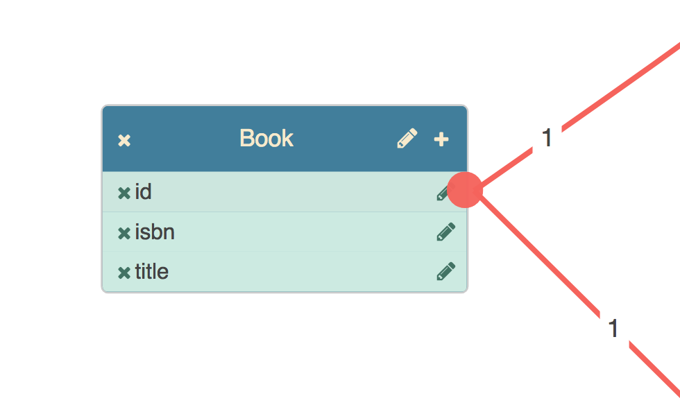
Here we see three columns, each of which has a button by which it can be deleted, and a button that launches a column name editor. These two bits of behaviour are handled by the component backing the port.
Definition
This is the definition of the component used to render columns on table nodes:
import { BasePortComponent } from "@jsplumbtoolkit/angular";

@Component({
  selector:"db-column",
  templateUrl:"templates/column.html"
})
export class ColumnComponent extends BasePortComponent {

  constructor(el: ElementRef) {
    super(el);
  }

  remove() { ... }

  editName() { ... }
}
There are three requirements for a component to be used to render a port:
- you must extend
BasePortComponent - your constructor must accept an
ElementRefand call the superclass constructor with it - you must declare a selector for the component
Template
The component definition maps a templateUrl. This is what the template looks like in this example:
<div class="table-column table-column-type-{{obj.datatype}}"
     attr.primary-key="{{obj.primaryKey}}" attr.data-jtk-port="{{obj.id}}"
     data-jtk-source="true" attr.data-jtk-scope="{{obj.datatype}}" data-jtk-target="true">

  <div class="table-column-delete" (click)="remove()">
    <i class="fa fa-times table-column-delete-icon"></i>
  </div>

  <div><span>{{obj.name}}</span></div>

  <div class="table-column-edit" (click)="editName()">
    <i class="fa fa-pencil table-column-edit-icon"></i>
  </div>

</div>
Mapping to a type
You map components to port types in the view. Here's the ports section from the view in the Angular Database Visualizer application:
ports: {
  "default": {
    component: ColumnComponent,
    paintStyle: { fill: "#f76258" },        // the endpoint's appearance
    hoverPaintStyle: { fill: "#434343" }, // appearance when mouse hovering on endpoint or connection
    edgeType: "common", // the type of edge for connections from this port type
    maxConnections: -1, // no limit on connections
    dropOptions: {  //drop options for the port. here we attach a css class.
      hoverClass: "drop-hover"
    },
    events: {
      "dblclick": (p:any) => {
        console.log(p);
      }
    }
  }
}
Declaration
You must declare each port component in both the declarations and entryComponents members of your
module definition. Here's the module definition for the Database Visualizer demonstration, for example:
import { DatabaseVisualizerComponent, TableNodeComponent, ViewNodeComponent, ColumnComponent } from './database-visualizer';

...

@NgModule({
    imports:[ BrowserModule, jsPlumbToolkitModule, jsPlumbToolkitDragDropModule, ROUTING],
    declarations: [ AppComponent, TableNodeComponent, ViewNodeComponent, ColumnComponent, DatasetComponent, DatabaseVisualizerComponent ],
    bootstrap:    [ AppComponent ],
    entryComponents: [ TableNodeComponent, ColumnComponent, ViewNodeComponent ],
    schemas:[ CUSTOM_ELEMENTS_SCHEMA ]
})

...
Here we see ColumnComponent listed in both declarations and entryComponents (along with the components used to render the node types table and view).
Checklist
- Each of your port components extends
BasePortComponentfrom the Toolkit's Angular integration - You reference the underlying data via the member
objin your component templates - Each of your components is declared in the
declarationslist in your module definition - Each of your components is declared in the
entryComponentslist in your module definition - You've mapped each expected port to a component in your
view
Change Detection
Default
If you're using Angular's default change detection mechanism (ChangeDetectionStrategy.Default) then your node/group/port/overlay components will be automatically updated whenever an updateNode, updateGroup, updatePort or updateEdge method is called on the Toolkit.
OnPush
If you'd prefer to use ChangeDetectionStrategy.OnPush, the Toolkit's angular integration can support that. The only requirement is that you need to inject a ChangeDetectorRef into any component with which you want to use OnPush change detection. For example, this is how we'd modify the ColumnComponent shown above to support OnPush change detection:
import { BasePortComponent } from "@jsplumbtoolkit/angular";

@Component({
    changeDetection:ChangeDetectionStrategy.OnPush,
    selector:"db-column",
    templateUrl:"templates/column.html"
})
export class ColumnComponent extends BasePortComponent {

  constructor(el: ElementRef, public changeDetectorRef:ChangeDetectorRef) {
    super(el)
  }

  remove() { ... }

  editName() { ... }
}
NOTE you must use the name changeDetectorRef for this constructor parameter, and you must also mark it public. The Toolkit discovers the change detector by name, not by type.
This also works for node/group components.
Integration with an existing application
This is a rough guide to integrating the Toolkit into an existing Angular application.
1. Add the Angular integration to your dependencies
"dependencies":{

  ...
  "@jsplumbtoolkit/browser-ui-angular":"^5.0.0"
  ...
}
2. Import the jsplumbtoolkit.css file into your CSS. This provides some sane defaults.
The default in an Angular CLI app is to use the styles.css file to orchestrate your css. We import it like this in our demo pages:
@import "../node_modules/@jsplumbtoolkit/browser-ui/css/jsplumbtoolkit.css";
3. Figure out where in your app you want to create an instance of the Toolkit.
You create instances of the Toolkit via the jsPlumb service. For instance, in our Angular demo, we do this in the ngInit method
of our AppComponent (the main component in the demo), after injecting the service:
export class AppComponent {

  @ViewChild(FlowchartComponent) flowchart:FlowchartComponent;
  @ViewChild(DatasetComponent) dataset:DatasetComponent;

  toolkitId:string;
  toolkit:jsPlumbToolkit;

  constructor(private $jsplumb:jsPlumbService, private elementRef:ElementRef) {
    this.toolkitId = this.elementRef.nativeElement.getAttribute("toolkitId");
  }

  ngOnInit() {
    this.toolkit = this.$jsplumb.getToolkit(this.toolkitId, this.toolkitParams)
  }

...
}
Note here that we read toolkitId from the DOM element but you could fix that to some string. You'll need this Toolkit ID when you configure your surface element below.
4. Create an empty component - and its template - that extends BaseNodeComponent:
@Component({ templateUrl:"templates/simple.html" })
export class SimpleNodeComponent extends BaseNodeComponent { }
This is about as simple a component as you can make; it has no code in it at all. But it is important that it extends BaseNodeComponent (which is part of the Toolkit's Angular integration).
Here's a basic template you could use (this would be in the file ./templates/simple.html according to the component declaration above):
<div style="width:100px;height:50px;outline:1px solid;">
  <h3>{{ obj.name }}</h3>
</div>
Note the underlying data is presented to an Angular template as obj. This is always the case.
5. Add the jsplumb-surface element to some component...
<jsplumb-surface [surfaceId]="surfaceId" [toolkitId]="toolkitId" [view]="view" [renderParams]="renderParams"></jsplumb-surface>
...and in the component provide a few things:
...


view = {
  nodes:{
    default:{
      component:SimpleNodeComponent
    }
  }
}

renderParams = {
  layout:{
    type:"Spring"
  }
}
view is the declarative mapping of definitions to rendering and behaviour, discussed in our documentation. This is a very simple view - it just maps a renderer for all node types.
renderParams are the parameters ultimately passed to the
rendercall on the underlying Toolkit instance. These are the parameters for the Surface widget. Here we just set a layout, but there’s a lot you can do with this.
6. Once you have done these steps, you should be able to load some data:
toolkit.load({
  nodes:[ {id:"1", name:"one"}, {id:"2", name:"two"}],
  edges:[ {source:"1", target:"2" } ]
})
Inputs and Outputs
One of the core concepts when working with components in Angular is that of @Inputs and @Outputs. For instance, maybe you have some component that expects to be told what text to use as its title, and which will output an event when the user clicks a button:
@Component({
    selector:"app-my-component",
    template:`
        <div>
            <h1>{{title}}</h1>
            <button class="btnEmit" (click)="emitEvent('test')">Click Me</button>
        </div>
    `
})
export class MyComponent {
  @Input() title:string

  @Output() outputEvent = new EventEmitter<string>()

  emitEvent(value:string) {
    this.outputEvent.emit(value)
  }
}
From version 5.6.2, the Toolkit's Angular integration now offers a couple of ways of working with these that earlier versions did not support.
Using @Input in a node component
Imagine the component shown above was being used to render some node type in your UI - with a couple of small changes we can make it so:
import {BaseNodeComponent} from "@jsplumbtoolkit/browser-ui-angular"
import {EventEmitter, Component, Input, Output} from "@angular/core"

@Component({
  template:`
          <div>
              <h1>{{title}}</h1>
              <button class="btnEmit" (click)="emitEvent('test')">Click Me</button>
          </div>
      `
})
export class NodeComponent extends BaseNodeComponent {
  @Input() title:string

  @Output() outputEvent = new EventEmitter<string>()

  emitEvent(value:string) {
    this.outputEvent.emit(value)
  }
}
We've removed selector from the Component spec, since it's not relevant when rendering via the Surface, and we've wired up the component to extend BaseNodeComponent, but other than that the component is the same as in the first example. Prior to version 5.6.2, this line:
@Input() title:string
would be ignored by the Toolkit. From 5.6.2 onwards, though, the Toolkit will attempt to set this input from the backing data for the node. So if, for instance, you had this data object for a node:
{
  "id": "1",
  "title": "My First Node"
}
then the Toolkit will set "My First Node" on the title input. This is of course really just a form of syntactic sugar - you could just easily render the title in your template like this (remembering that obj is set on the component by the Toolkit when it creates it):
<h1>{{obj.title}}</h1>
as you can by using the input on the class:
<h1>{{title}}</h1>
but if you're like me, you might find that the approach using @Input feels a little more nicely formalised.
Using @Output in a node component
You can also now wire up listeners to @Outputs in your components. The process to do this involves providing a vertexEvent callback to the Surface component. For example, imagine you embed a surface component in one of your components:
<div class="my-component">
    <h3>Here is my component</h3>
    <jsplumb-surface surfaceId="surface"
                   toolkitId="myToolkit"
                   [view]="view"
                   [renderParams]="renderParams"
                  (vertexEvent)="vertexEvent($event)">
    </jsplumb-surface>
</div>
Remember from above the @Output() outputEvent... declaration on the node component? Whenever that output emits something, the Surface will invoke vertexEvent:
import { Vertex } from "@jsplumbtoolkit/core"
import { ComponentRef } from "@angular/core"

vertexEvent(detail:{
    vertex:Vertex,
    event:Event,
    payload:any,
    component:ComponentRef<any>}) {

}
The callback is given the Toolkit's vertex, the original event, the payload (ie. whatever was emitted from the output), and the Angular ComponentRef. You can access the specific Angular component via the instance field on this component ref.
Angular Component Overlays
From version 5.10.4 onwards, the Toolkit's Angular integration offers the ability to use Angular components as overlays.
Example
You map Angular components to overlays in the view options that you pass in to the jsplumb-surface component:
import {Component} from "@angular/core"

import { AngularOverlayComponentType } from "@jsplumbtoolkit/browser-ui-angular"

import { MyAngularOverlay } from './my-angular-overlay.ts'

@Component({
    template:`<div><jsplumb-surface [view]="view" [renderParams]="renderParams" toolkitId="tk" surfaceId="mySurface"></jsplumb-surface></div>`
})
export class MyComponent {

    view:AngularViewOptions = {
        ...
        edges:{
            "myEdgeType":{
                overlays:[
                    {
                        type:AngularComponentOverlayType,
                        options:{
                            component:MyAngularOverlay
                        }
                    }
                ]
            }
        }
    }
}
Overlay code
import {Component} from "@angular/core"

import { AngularOverlayComponent, Surface} from "@jsplumbtoolkit/browser-ui-angular"
import {Edge, JsPlumbToolkit, ObjectData} from "@jsplumbtoolkit/core"

@Component({
    template:`<div><h1>{{obj.title}}</h1></div>`
})
export class MyAngularOverlay implements AngularOverlayComponent {

    toolkit:JsPlumbToolkit
    edge:Edge
    obj:ObjectData
    surface:Surface

    makeAnEdit() {
        this.toolkit.updateEdge(this.edge, {msg:"true"})
    }
}
Our component class declares that it implements AngularOverlayComponent. This is not a strict requirement, since at runtime interfaces are elided anyway and the code allows any for the component option of the overlay spec. However, the Toolkit will write those four fields onto the component it instantiates, and at the very least you'll likely want to expose obj since, as with node/group components, it is the class member you use in your template.
BaseAngularOverlayComponent
The Angular integration also offers an abstract class - BaseAngularOverlayComponent - that you can extend, if it is convenient to do so in your use case. The benefits of using this class are that it comes with a couple of helper methods for working with the underlying edge. But it may not be suitable for your use case, for instance if you're re-using a component from somewhere else.
We could rewrite the component overlay code using BaseAngularOverlayComponent as follows:
import {Component} from "@angular/core"

import { BaseAngularOverlayComponent } from "@jsplumbtoolkit/browser-ui-angular"

@Component({
    template:`<div><h1>{{obj.title}}</h1></div>`
})
export class MyAngularOverlay extends BaseAngularOverlayComponent {

    makeAnEdit() {
        this.updateEdge({msg:"true"})
    }

    removeMe() {
        this.removeEdge()
    }
}
Notes:
- there is no constructor in
BaseAngularOverlayComponentthat needs to be invoked with asuper(..)call - there is an
updateEdge(updates:ObjectData)method available on the base component - there is a
removeEdge()method available on the base component
updateEdge and removeEdge are actually exposed as public methods on the base component and can be invoked directly from your code.
Further Reading
Demonstrations for the jsPlumb Toolkit are available on Github. There are 3 that use the Angular integration, each of which is documented: