- Imports
- Setup
- jsPlumb Service
- jsPlumb Components
- jsplumb-surface
- jsplumb-miniview
- jsplumb-surface-drop
- jsplumb-drag-drop
- Rendering Nodes and Groups
- Rendering Ports
- Integration with an existing application
- Supported Versions
Angular Integration
The jsPlumb Toolkit has a service and several components/directives to assist you in integrating with Angular (10.x, 9.x, 8.x, 7.x, 6.x, 5.x, 4.x and 2.x - for Angular 1.x integration, refer to this page ).
Note: Angular 8 introduced a new compiler - the Ivy compiler. The Toolkit has been tested against this compiler.
package.json
Add these lines to your package.json:
"dependencies": {
    ...
    "jsplumbtoolkit":"file:./somewhere/jsplumbtoolkit.tgz",
    "jsplumbtoolkit-angular":"file:./somewhere/jsplumbtoolkit-angular.tgz",

    ...
},
import { jsPlumbToolkitModule } from "jsplumbtoolkit-angular";
...
@NgModule({
imports: [ BrowserModule, jsPlumbToolkitModule, jsPlumbToolkitDragDropModule, ROUTING ],
declarations: [ AppComponent, QuestionNodeComponent, ActionNodeComponent, StartNodeComponent, OutputNodeComponent, DatasetComponent, FlowchartComponent, ControlsComponent ],
bootstrap: [ AppComponent ],
entryComponents: [ QuestionNodeComponent, ActionNodeComponent, StartNodeComponent, OutputNodeComponent ],
schemas:[ CUSTOM_ELEMENTS_SCHEMA ]
})This example comes from the Angular demonstration that ships with the Toolkit. Note that you need to import the CUSTOM_ELEMENTS_SCHEMA schema.
Component imports
To import components inside a .ts file:
import { jsPlumbSurfaceComponent, jsPlumbMiniviewComponent, jsPlumbPaletteComponent } from "jsplumbtoolkit-angular";At the core of jsPlumb's Angular integration is the jsPlumb Service, which offers access to, and management of, Toolkit instances and Surfaces. It is recommended to create an instance of the Toolkit programmatically at the top level of your application, which you can then share between different components. For instance, this is the ngOnInit method of the top level component in the Angular demo that ships with the Toolkit:
export class AppComponent {
@ViewChild(FlowchartComponent) flowchart:FlowchartComponent;
@ViewChild(DatasetComponent) dataset:DatasetComponent;
toolkitId:string;
toolkit:jsPlumbToolkit;
constructor(private $jsplumb:jsPlumbService) {
this.toolkitId = "flowchart";
}
ngOnInit() {
this.toolkit = this.$jsplumb.getToolkit(this.toolkitId, this.toolkitParams)
}
...
}
Methods
The jsPlumb Service offers several methods. getToolkit and getSurface are the methods client applications will mostly use; unless you write your own component that renders a Surface you won't need to use the methods that add/remove Surfaces.
getToolkit(id:string, params?:jsPlumbToolkitOptions)
Either retrieves an existing Toolkit with the given ID, or creates a Toolkit instance and returns it. Options for the Toolkit instance may be passed in as the second argument; these are ignored if a Toolkit with the given ID already exists.
getSurface(id:string, callback:(surface:Surface)=>void, _params:SurfaceOptions)
Either retrieves the Surface with the given ID, or creates one, with the given Surface options, and returns it. The second argument to this method is a callback function - it is asynchronous, not returning the Surface until it has been initialised fully.
addSurface(id:string, surface:Surface)
Registers a Surface with the service. This method is used by the jsplumb-surface component that ships with the Toolkit.
removeSurface(id:string, surface:Surface)
Unregisters a Surface from the service, also calling destroy on the Surface (which calls destroy on any attached Miniviews). This method is used by the jsplumb-surface component that ships with the Toolkit.
addMiniview(surfaceId:string, params:MiniviewOptions)
Used by the jsplumb-miniview component.
The Toolkit offers 2 Components and 2 Directives:
This is a Component that provides a Surface widget to render the contents of some Toolkit instance.
<jsplumb-surface jtkId="toolkit" surfaceId="surfaceId" [renderParams]="anObjectReference" [view]="anObjectReference" [nodeResolver]="aFunctionReference">
</jsplumb-surface>Attributes
All attributes are optional except nodeResolver and jtkId.
jtkIdID of the Toolkit instance to render.surfaceIdUnique ID for the Surface widget. Required if you wish to attach a Miniview or a Palette.renderParamsParameters to pass in to the constructor of the Surface widget.viewView parameters. Views are discussed here.
TOP
This is a Component that provides a Miniview that can be attached to some Surface.
Attributes
surfaceIdID for the Surface widget to which to attach the Miniview.elementFilterOptional filter used to control which nodes/groups the Miniview will display.
To use the elementFilter you need to provide a reference to a Function, whose method signature is
For instance,
Then in your code you might have :
redNodeFilter(obj: Node | Group): boolean {
return obj.objectType === "Node" && obj.data.type === "red";
}Here, only Nodes that have a type of red will be shown in the miniview.
Methods
The Miniview component offers a method to repaint itself:
This will invalidate the miniview, reposition all the elements it is managing, and zoom everything to fit the miniview's viewport.
TOP
This Directive wraps an instance of the Drop Manager, and is an improvement over the previous jsplumb-palette in a few ways:
- it uses a delegated drag handler so you do not need to inform it when its child content has been updated
- the component can be enabled/disabled
- it supports dropping nodes onto edges
Setup
You need to include a couple of extra things to access this component:
"jsplumbtoolkit-drop": "file:../../jsplumbtoolkit-drop.tgz",
"jsplumbtoolkit-angular-drop": "file:../../jsplumbtoolkit-angular-drop.tgz"And you also need to import and then reference the jsPlumbToolkitDragDropModule:
...
import { jsPlumbToolkitDragDropModule } from "jsplumbtoolkit-angular-drop";
...
@NgModule({
...
imports:[ ..., jsPlumbToolkitDragDropModule, ...],
...
})
Example
This comes from the Angular Flowchart Builder demonstration:
<div class="sidebar node-palette"
jsplumb-surface-drop
selector="div"
surfaceId="flowchartSurface"
[dataGenerator]="dataGenerator">
<div *ngFor="let nodeType of nodeTypes" class="sidebar-item" [attr.data-node-type]="nodeType.type" title="Drag to add new" [attr.jtk-width]="nodeType.w" [attr.jtk-height]="nodeType.h">{{nodeType.label}}</div>
</div>Attributes
- selector:string A valid CSS3 selector identifying descendant nodes that are to be configured as draggable/droppables.
- dataGenerator:(el:HTMLElement) => T This Function is used to provide default data for some Node/Group. Your
dataGeneratorfunction is expected to determine the "type" of the object being dragged, and to set it on the data object if desired. - surfaceId Required. The ID of the Surface to which to attach the Drop Manager.
- allowDropOnGroup:boolean Optional, defaults to true. If true, then elements can be dropped onto nodes/groups, and in the event that occurs, the
onDropmethod will be called. - allowDropOnCanvas:boolean Optional, defaults to true. When an element is dropped on the canvas whitespace, it is added to the dataset and rendered.
- allowDropOnEdge:boolean Optional, defaults to true. If true, then elements can be dropped onto edges, and in the event that an element is dropped on an edge, a new node/group is added and inserted between the source and target of the original edge, and the original edge is discarded..
- typeGenerator:(data:T) => string Optional. A function that can return the correct type for some data object representing an element being dragged. By default the Toolkit will use the
typemember of the data object. - groupIdentifier:(d: T, el: HTMLElement) => boolean Optional. By default, the toolkit looks for a
jtk-is-groupattribute on an element being dragged. If found, with a value of"true", then the Toolkit assumes a group is being dragged. You can supply your own function to make this decision.
NOTE Unless you need to respond to a drop on a node, the Surface Drop Manager provides a more simple way of configuring drag/drop of new items. This section is still valid, but it's not the fastest way of adding the functionality.
This Directive wraps an instance of the Drop Manager, and is an improvement over the previous jsplumb-palette in a few ways:
- it uses a delegated drag handler so you do not need to inform it when its child content has been updated
- the component can be enabled/disabled
- it supports dropping nodes onto edges
Setup
You need to include a couple of extra things to access this component:
"jsplumbtoolkit-drop": "file:../../jsplumbtoolkit-drop.tgz",
"jsplumbtoolkit-angular-drop": "file:../../jsplumbtoolkit-angular-drop.tgz"And you also need to import and then reference the jsPlumbToolkitDragDropModule:
...
import { jsPlumbToolkitDragDropModule } from "jsplumbtoolkit-angular-drop";
...
@NgModule({
...
imports:[ ..., jsPlumbToolkitDragDropModule, ...],
...
})
Example
This comes from a previous version of the Angular Flowchart Builder demonstration, which now uses the Surface Drop Manager:
<div class="sidebar node-palette"
jsplumb-drag-drop
selector="div"
surfaceId="flowchartSurface"
[dataGenerator]="dataGenerator"
[onCanvasDrop]="onCanvasDrop"
[onEdgeDrop]="onEdgeDrop">
<div *ngFor="let nodeType of nodeTypes" class="sidebar-item" [attr.data-node-type]="nodeType.type" title="Drag to add new" [attr.jtk-width]="nodeType.w" [attr.jtk-height]="nodeType.h">{{nodeType.label}}</div>
</div>Attributes
selectorA valid CSS3 selector identifying descendant nodes that are to be configured as draggable/droppables.surfaceIdThe ID of the Surface to which to attach the Palette.dataGenerator(el:HTMLElement):TThis optional Function can be used to provide default data for some Node/Group. YourdataGeneratorfunction is expected to determine the "type" of the object being dragged, and to set it on the data object if desired.onCanvasDrop(surface:Surface, data:T, positionOnSurface:CanvasLocation):voidOptional. When present, drop on whitespace is enabled. Dropping an object on whitespace will result in this method being called.onEdgeDrop(surface:Surface, data:T, edge:Edge, positionOnSurface:CanvasLocation)Optional. When present, drop on edges is enabled. Dropping an object on an edge will result in this method being called.onDrop(data:T, target:Node|Group, draggedElement?:HTMLElement, e?:Event, position?:PointArray)Optional. When present, drop on nodes/groups is enabled, and dropping an object on a node/group will result in this method being called.
Each Node or Group in your UI is rendered as an individual component. These component definitions need to be included in the declarations and entryComponents members of your application's module definition.
Definition
As an example, consider the component we use to render an Action node in the Flowchart builder demonstration:
@Component({ templateUrl:"templates/action.html" })
export class ActionNodeComponent extends BaseEditableNodeComponent { }Here, BaseEditableNodeComponent is a class that declares a couple of common editing methods for that specific demonstration. But there is a key piece in the declaration of BaseEditableNodeComponent that you must take into account:
... the fact that it extends BaseNodeComponent. Your components must extend BaseNodeComponent.
Template
The component definition maps a templateUrl. This is what the template looks like in this example:
<div [style.width]="obj.w + 'px'" [style.height]="obj.h +'px'" class="flowchart-object flowchart-action">
<div>
<div class="node-edit node-action" (click)="editNode(obj)">
<i class="fa fa-pencil-square-o"></i>
</div>
<div class="node-delete node-action" (click)="removeNode(obj)">
<i class="fa fa-times"></i>
</div>
<svg [attr.width]="obj.w" [attr.height]="obj.h">
<rect [attr.x]="0" [attr.y]="0" [attr.width]="obj.w" [attr.height]="obj.h" class="outer"/>
<rect [attr.x]="10" [attr.y]="10" [attr.width]="obj.w-20" [attr.height]="obj.h-20" class="inner"/>
<text text-anchor="middle" [attr.x]="obj.w/2" [attr.y]="obj.h/2" dominant-baseline="central">{{obj.text}}</text>
</svg>
</div>
<jtk-target port-type="target"></jtk-target>
<jtk-source port-type="source" filter=".outer"></jtk-source>
</div>It's a standard Angular template. The main thing to be aware of here is that the backing data for the Node or Group is presented as the member obj to the template. You don't, of course, need to use the templateUrl approach - you can provision the template in any way that Angular supports, including directly as a multi-line string via the template parameter.
Mapping to a type
You map components to node/group types in the view. Here's the nodes section from the view in the Angular Flowchart Builder application:
view = {
nodes:{
"start":{
component:StartNodeComponent
},
"selectable": {
events: {
tap: (params:any) => {
this.toggleSelection(params.node);
}
}
},
"question":{
parent:"selectable",
component:QuestionNodeComponent
},
"output":{
parent:"selectable",
component:OutputNodeComponent
},
"action":{
parent:"selectable",
component:ActionNodeComponent
}
},
edges: {
...
}
}In previous versions of the Toolkit's Angular integration it was necessary to map component names to actual components via a nodeResolver function, but from 1.11.0 this is no longer necessary.
Declaration
You must declare each Node/Group component in both the declarations and entryComponents members of your module definition. Here's the module definition for the Flowchart builder demonstration, for example:
import { jsPlumbToolkitModule } from "jsplumbtoolkit-angular";

...

@NgModule({
    imports:      [ BrowserModule, jsPlumbToolkitModule, jsPlumbToolkitDragDropModule, ROUTING ],
    declarations: [ AppComponent, QuestionNodeComponent, ActionNodeComponent, StartNodeComponent, OutputNodeComponent, DatasetComponent, FlowchartComponent, ControlsComponent ],
    bootstrap:    [ AppComponent ],
    entryComponents: [ QuestionNodeComponent, ActionNodeComponent, StartNodeComponent, OutputNodeComponent ],
    schemas:[ CUSTOM_ELEMENTS_SCHEMA ]
})Checklist
- Each of your components extends
BaseNodeComponentfrom the Toolkit's Angular integration - You reference the underlying data via the member
objin your component templates - Each of your components is declared in the
declarationslist in your module definition - Each of your components is declared in the
entryComponentslist in your module definition - You've mapped each expected node/group type to a component in your
view
Some applications whose data model use ports have a UI in which each Port is assigned its own DOM element. In the Flowchart Builder application we use ports in the data model (a question node, for instance, has a Yes and a No output port), but we do not assign a DOM element to each port. In the Database Visualizer, though, we do: we model a database table as a node, and the columns on that table as ports, and each port is assigned its own DOM element:
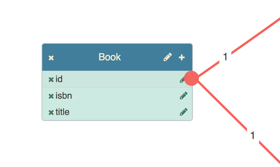
Here we see three columns, each of which has a button by which it can be deleted, and a button that launches a column name editor. These two bits of behaviour are handled by the component backing the port.
Definition
This is the definition of the component used to render columns on table nodes:
import { BasePortComponent } from "jsplumbtoolkit-angular";

@Component({
  selector:"db-column",
  templateUrl:"templates/column.html"
})
export class ColumnComponent extends BasePortComponent {

  constructor(el: ElementRef) {
    super(el);
  }

  remove() { ... }

  editName() { ... }
}
There are three requirements for a component to be used to render a port:
- you must extend
BasePortComponent - your constructor must accept an
ElementRefand call the superclass constructor with it - you must declare a selector for the component
Template
The component definition maps a templateUrl. This is what the template looks like in this example:
<li class="table-column table-column-type-{{obj.datatype}}" data-primary-key="obj.primaryKey" data-port-id="obj.id">
  <div class="table-column-edit" (click)="editName()">
    <i class="fa fa-pencil table-column-edit-icon"></i>
  </div>
  <div class="table-column-delete" (click)="remove()">
    <i class="fa fa-times table-column-delete-icon"></i>
  </div>
  <div><span>{{obj.id}}</span></div>
  <!--
      configure the li as an edge source, with a type of column, a scope derived from
      the columns datatype, and a filter that prevents dragging new edges from the delete button or from the label.
  -->
  <jtk-source port-id="{{obj.id}}" scope="{{obj.datatype}}" filter=".table-column-delete, .table-column-delete-icon, span, .table-column-edit, .table-column-edit-icon" filter-exclude="true"></jtk-source>
  <!--
      configure the li as an edge target, with a type of column, and a scope derived from the
      column's datatype.
  -->
  <jtk-target port-id="{{obj.id}}" scope="{{obj.datatype}}"></jtk-target>
</li>
Mapping to a type
You map components to port types in the view. Here's the ports section from the view in the Angular Database Visualizer application:
ports: {
  "default": {
    component: ColumnComponent,
    paintStyle: { fill: "#f76258" },        // the endpoint's appearance
    hoverPaintStyle: { fill: "#434343" }, // appearance when mouse hovering on endpoint or connection
    edgeType: "common", // the type of edge for connections from this port type
    maxConnections: -1, // no limit on connections
    dropOptions: {  //drop options for the port. here we attach a css class.
      hoverClass: "drop-hover"
    },
    events: {
      "dblclick": (p:any) => {
        console.log(p);
      }
    }
  }
}
Declaration
You must declare each port component in both the declarations and entryComponents members of your module definition. Here's the module definition for the Database Visualizer demonstration, for example:
import { DatabaseVisualizerComponent, TableNodeComponent, ViewNodeComponent, ColumnComponent } from './database-visualizer';

...

@NgModule({
    imports:[ BrowserModule, jsPlumbToolkitModule, jsPlumbToolkitDragDropModule, ROUTING],
    declarations: [ AppComponent, TableNodeComponent, ViewNodeComponent, ColumnComponent, DatasetComponent, DatabaseVisualizerComponent ],
    bootstrap:    [ AppComponent ],
    entryComponents: [ TableNodeComponent, ColumnComponent, ViewNodeComponent ],
    schemas:[ CUSTOM_ELEMENTS_SCHEMA ]
})

...
Here we see ColumnComponent listed in both declarations and entryComponents (along with the components used to render the node types table and view).
Checklist
- Each of your port components extends
BasePortComponentfrom the Toolkit's Angular integration - You reference the underlying data via the member
objin your component templates - Each of your components is declared in the
declarationslist in your module definition - Each of your components is declared in the
entryComponentslist in your module definition - You've mapped each expected port to a component in your
view
This is a rough guide to integrating the Toolkit into an existing Angular application.
1. Copy the toolkit imports (toolkit + toolkit angular) from the Angular demo into your package.json, and get them installed.
"dependencies":{

  ...
  "jsplumbtoolkit":"file:path/to/jsplumbtoolkit.tgz",
  "jsplumbtoolkit-angular":"file:path/to/jsplumbtoolkit-angular.tgz",
  ...
}
2. Import the jsplumbtoolkit-defaults.css file into your CSS. This provides some sane defaults.
The default in an Angular CLI app is to use the styles.css file to orchestrate your css. We import it like this in our demo pages:
3. Figure out where in your app you want to create an instance of the Toolkit.
You create instances of the Toolkit via the jsPlumb service. For instance, in our Angular demo, we do this in the ngInit method of our AppComponent (the main component in the demo), after injecting the service:
export class AppComponent {

  @ViewChild(FlowchartComponent) flowchart:FlowchartComponent;
  @ViewChild(DatasetComponent) dataset:DatasetComponent;

  toolkitId:string;
  toolkit:jsPlumbToolkit;

  constructor(private $jsplumb:jsPlumbService, private elementRef:ElementRef) {
    this.toolkitId = this.elementRef.nativeElement.getAttribute("toolkitId");
  }

  ngOnInit() {
    this.toolkit = this.$jsplumb.getToolkit(this.toolkitId, this.toolkitParams)
  }

...
}
Note here that we read toolkitId from the DOM element but you could fix that to some string. You'll need this Toolkit ID when you configure your Surface element below.
4. Create an empty component - and its template - that extends BaseNodeComponent:
@Component({ templateUrl:"templates/simple.html" })
export class SimpleNodeComponent extends BaseNodeComponent { }
This is about as simple a component as you can make; it has no code in it at all. But it is important that it extends BaseNodeComponent (which is part of the Toolkit's Angular integration).
Here's a basic template you could use (this would be in the file ./templates/simple.html according to the component declaration above):
Note the underlying data is presented to an Angular template as obj. This is always the case.
5. Add the jsplumb-surface element to some component...
<jsplumb-surface [surfaceId]="surfaceId" [toolkitId]="toolkitId" [view]="view" [renderParams]="renderParams"></jsplumb-surface>...and in the component provide a few things:
...


view = {
  nodes:{
    default:{
      component:SimpleNodeComponent
    }
  }
}

renderParams = {
  layout:{
    type:"Spring"
  }
}
view is the declarative mapping of definitions to rendering and behaviour, discussed in our documentation. This is a very simple view - it just maps a renderer for all node types.
renderParams are the parameters ultimately passed to the
rendercall on the underlying Toolkit instance. These are the parameters for the Surface widget. Here we just set a layout, but there’s a lot you can do with this.
6. Once you have done these steps, you should be able to load some data:
toolkit.load({
  nodes:[ {id:"1", name:"one"}, {id:"2", name:"two"}],
  edges:[ {source:"1", target:"2" } ]
})
Further Reading
Demonstrations for the jsPlumb Toolkit are available on Github. There are 3 that use the Angular integration, each of which is documented:
All versions of Angular from 2 through 10 are supported. Our demonstration pages all use Angular 9, but the Toolkit has also been tested against 10.x, 8.x, 7.x, 6.x, 5.x and 2.x.